
Hero Section
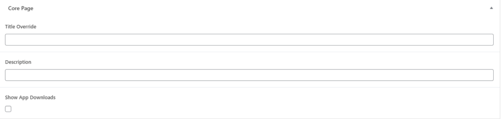
‘Scroll down to the bottom of the Page Editor. You will see three items:
- Title Override: By default the title in the hero section is the Page Title. However, if you’d like to override this, type something in this field
- Description: This is the “paragraph” text that will go below the title of the page
- Show App Downloads: Check this box to show the App Download icons
The last thing to know is that the image in the “droplet” is the Featured Image. You can access the Featured Image from the right side bar while editing a page.
Block: Page Section
Think of this block as a row. All of the content on your page needs to be inside a row. For each new section you create, first, drop a Page Section block to ensure everything stays nice and aligned. There are a few options within this block:
- Corner Crop: Check off each box that you want the corner rounded
- Section Color: Which background color from your color palette would you like this section to be?
- Top and Bottom Spacing: Choose how much space between elements you’d like to have.
Block: Image Droplet/Circles
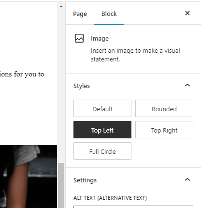
You can drop the standard Image block anywhere on a page. Once you so so, you’ll see the Settings panel on the right side. Under the Styles section, there will be three custom options for you to select from:
- Top Left
- Top Right
- Full Circle
A sample of each style is shown below.


Block: Content Cards
Search for the block Content Cards. This block allows for as many cards as you want. Just supply an icon image, heading, and description. The block is smart and will place the pods in the appropriate number of columns and rows. The cards will switch layouts based on whether you have an even or odd number of cards.
Odd sample:

Title Goes Here
Here is some sample text. Here is some sample text. Here is some sample text.
Another Title
Here is some sample text. Here is some sample text. Here is some sample text.
Third Sample Title
Here is some sample text. Here is some sample text. Here is some sample text.
Even sample:
Title Goes Here
Here is some sample text. Here is some sample text. Here is some sample text.
Another Title
Here is some sample text. Here is some sample text. Here is some sample text.
Third Sample Title
Here is some sample text. Here is some sample text. Here is some sample text.
Fourth Sample Card
Here is some other sample text. Here is some other sample text.
Editing the Main Menu
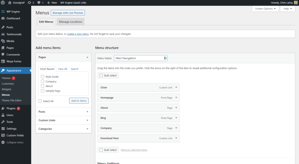
On the left side, hover over Appearance and click on Menus. The primary navigation should already be selected (but it’s called Main Navigation). You can check boxes on the left, and then click Add to Menu. You can then move the menu items up and down. Your website has been programmed for a single-level of menus (drop-downs not supported).
The Close menu button has special functionality and should not be removed. It only shows up on the mobile menu, and is the trigger to close the menu.